|
|
|
|
ILLUSTRATION BY ANTHONY CERICOLA |
|
Optical Makeover
Create a new image for your practice.
BY LARRY FUNSTON AND JUDY CADLE, C.O.E.
They say change is good. If you're standing still, you're actually losing ground. Although these axioms aren't true in every case, they do apply to today's eyecare world.
I think of optometry as having two primary service categories: clinical eye care and optical eye wear. The frame area has become much more than just a frame room. So much so that it's difficult to relate to the earlier days when O.D.s asked patients to choose between a black or brown frame.
Display pros and cons
In the years between exam room frame selection and the optical makeover of today, designers have used a variety of techniques to display a large quantity of frames. Even though you can choose from many ways to display frames, these options fall into two categories: mass display and feature display.
Traditionally, frames have been presented in movable display case furniture or on wall-mounted displays with rows of frame bars fixed in place. Which-ever display you choose, you can display masses of frames.
Use feature displays to feature a brand name frame, to suggest a need (such as biking or skiing), to relate to the patient's lifestyle, to announce a service and so on.
|
|
|
|
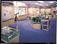
"Wood is always fashionable," says designer Lynn Franklin of Fashion Optical Displays. Her company offers oak and mahogany in three different color stains as well as natural maple. |
|
Retail designers refer to mass display as rigid display (or essentially inflexible display). Mass display has the advantage of accommodating categories and quantities of frames. It shows most of the inventory and impresses the patient with choices.
It has the disadvantage of requiring a major renovation when it's time for a new look or a merchandising change. And it does little to educate or inform the patient about eyewear choices.
Flexible displays accommodate both mass and feature displays and give the option of including the frame with a graphic, written information and brand identification. Flexible feature displays tell a more complete story about the frame.
The need for innovation in showing frames, presenting lens choices and discovering lifestyle needs has been driven by forces that are, for the most part, external to the practice.
At the risk of stating the obvious, the major external forces appear to come from patient demand (expectations created by retailers) and the interaction of new technology, optical chain innovations, new markets and new marketing techniques used by suppliers.
What do patients want?
Patients' expectations have changed. You now have patients coming to your practice asking for brand names in treatments, drugs, contact lenses and eyeglass frames. This phenomenon can be off-putting, but if you look at the bright side, it offers you the opportunity and challenge to serve your patients as you never have before.
|
|
|
|
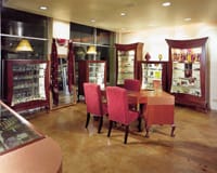
EyeDesigns Co-President and Co-Founder Alan Winig says that today's offices are designed for longevity. The company designed this O.D.'s Studio City, Calif. office. Photo courtesy of EyeDesigns. |
Say something about yourself
The optical makeover idea makes a statement about your practice. It supports your professionalism. It can tell patients, "Now that you've had an excellent, thorough eye exam, enjoy the process of choosing your eye wear. We'll listen to your wants and needs and we'll surpass your expectations!"
Well then, what are the elements of an optical makeover?
Makeover basics
The components of a successful office makeover include efficiency, frame display, lighting, inventory control, lifestyle presentation and branding. Let's take a deeper look into these components.
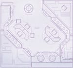
Efficiency. The optical staff needs more than a bench can provide to fill a patient's order. And they need to be on the "floor" in the frame area as much as possible so patients aren't neglected. You can easily incorporate a new workstation into the frame display area in an L or U shape and still allow for computer and telephone hook up, cabinets for catalogs, personal belongings, measurement and educational tools, with patient and guest seating.
Several qualifications are required to plan the optical area. For example, do you want patients to sit so the frame stylist can bring frames to them? Do you want the patient to browse? How will the patient enter the frame room? How is the handoff of the patient executed? Important key elements such as outside light, visual openness, flow through the area and controlled exit, all create the criteria required for the design.
Design-by-function can solve a number of everyday issues having to do with patient flow, staff flow, waiting times, staff availability, quality of product and service.
|
|
|
|
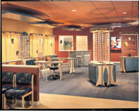
Fashion Optical Displays did a makeover on this office using a combination of wood and laminants. Photo courtesy of Fashion Optical Displays |
Frame display. A newer solution to displaying frames combines the concept of rigid (mass) and flexible (feature) displays in a system designed to accommodate change. As display needs and solutions change, the displays can include more or less rigid display. You can also add new modules of updated display concepts.
The usual criteria for how much feature and mass display to use is in the imagination of the O.D. and his staff. The benchmark we use is to make the area look like it's all frame display using sections of mass display mixed with feature display.
Using a display system to support glass shelves, mirrors, shadow boxes, graphics, trays and individual frame bars keeps the area interesting to the patient. Flexibility and the mix-and-match approach create a versatile atmosphere for merchandising as well as tasteful supplier displays (particularly for lines that your office carries exclusively).
Lighting. A lighting consultant recently told us that by using the best of today's technology, a typical business can save 70% to 90% of the energy used in light systems without any loss of function. Obviously, the optometric practice isn't the typical business he was referring to, but nonetheless, there have been remarkable improvements in lighting and there are savings to be had.
In addition to lowering maintenance costs, the use of the latest fixtures, lamps and bulbs in a lighting design for the optical area helps create highly attractive areas. The newer lighting uses less wattage and therefore is cooler and more comfortable for the patient and staff. The new compact fluorescent lighting is available in a variety of color choices. The control of light and the quality of color rendering are now options in determining the best lighting design solution.
Controlling inventory. Displaying frames in a flexible approach requires fewer frames for the display to look terrific. This is good news to practices that have been locked into walls lined with mass display. It's difficult to reduce inventory if the result is glaringly, empty frame bars.
|
|
|
|
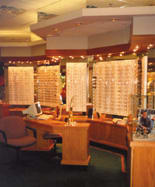
This is a good example of a rigid mass display. The format accommodates volume of frames attractively. |
|
The optical makeover looks great throughout the day as frames are sold because frames aren't rigidly lined up. Likewise, the new optical can accommodate inventory ups and downs that naturally occur during the fiscal year.
Lifestyle presentation. By changing walls lined with mass display into flexible feature display, the optical area will seem to open up and look bigger. You'll even have more space available. Your instinct might be to set aside fewer square feet, but we strongly recommend resisting the urge. Use the open space for bigger-than-life feature displays.
We love the idea of bringing in a Harley-Davidson and a couple of mannequins to show off your Harley frame line. Or, for an office in white water country, you could bring in a canoe and tent set up for the Bollé display.
Liken the investment in the frame room to typical retail business. Malls generally require a complete renovation (remerchandising) of the store every 5 years and mall owners often include this as a condition of the lease agreement. They do this because they know it stimulates business.
Keep the frame room current to create the return on investment that you desire. The concern we have with a smaller renovation or a partial renovation (such as only adding a new display module) is that it can make the remainder of the space appear even more dated.
Creating a budget for an optical makeover depends on the criteria you defined for the use of space. Typically, you can use a cost per square foot range as a guide for creating a budget. Obviously, the variables are many and wide ranging in cost, but as a guide, consider between $60 and $80 per square foot for the area you're renovating.
|
|
|
|
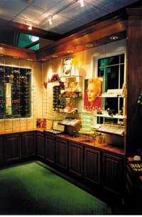
Wall of frame display includes a combination of mass and feature displays in a flexible format. Change to more or less mass or feature display is easily accommodated. Photo courtesy of Oadbe Associates. |
Examples of the variables include the physical attrib-utes of the space you're renovating, the materials used for finishing floors, walls and ceilings, lighting choices, electrical, air conditioning and furnishings. Depending on the project, you could consider other features and options.
Branding. Branding is a new technique that retailers are using to create immediate recognition with the customer. It's being used by eyecare suppliers too.
An excellent example of well-executed branding is the retail chain store Target. Over time, Target has established a firm position as a well-priced, good-quality retailer, holding its own in competition with Wal-Mart.
In fact, over the holidays, Target commercials had boldly excluded their name. The TV ads showed the fun of shopping and Target's red and white bull's eye, without their name appearing anywhere in the ad. In spite of the omission, it was clearly a Target ad and a show of branding strength.
Nike is another excellent example -- the company's swoosh tells its story.
An optical area with easy, flexible feature display offers the opportunity to make the most of well-branded optical products. The patient who came into your office asking for services and materials by brand name will feel comfortable seeing the now-familiar Varilux materials. They've seen Varilux on TV and in print many times. Patients noticing that high-quality, well-branded products are available in your optical area will feel more comfortable and confident. Making the most of appropriate branding can support patient education and lifestyle evaluation for a positive outcome in patient care.
The newer approach to designing the optical area can emphasize the strengths of your practice and carry them further by adding excitement and change to your excellent services. Change in this sense means growth. You can use the change to further brand your practice. You can use solid innovation to grow your office. OM
Larry Funston is managing designer of Oadbe Associates, Ltd., a Canadian firm specializing in ophthalmic office design. You can reach him at (905) 625-8555. Visit the Oadbe Web site at www.oadbe.com.
Judy Cadle is with SammDrummer Design & Marketing specializing in the eyecare industry. Contact her at 859.879.3407.
|
Trends from Optical Design Manufacturers |
|
FASHION OPTICAL DISPLAYS Fashion Optical Displays only works with optometric offices and has been in business since 1970. Designer Lynn Franklin says that they've seen lost of changes in frames and in turn, in the way that they're supported and merchandised. "Now, we're seeing a lot more of the frames, we're not hiding them in holes. We're also seeing more educational displays and more merchandising of frames and cases. "In our company's designs, we're seeing a trend toward the wood displays," says Franklin. "We offer different kinds of wood -- oak and mahogany in three different color stains and natural maple. Wood is always fashionable. We're also using laminants -- especially the marble type -- as trim or accent colors." Fashion Optical Displays offers two types of lighting systems: fluorescent and halogen, which work in different settings, according to Franklin. She says that any optometrist who's looking into redesigning their optical area should take advantage of their free dispensary design service. "All we need to do it is the dimensions of the doctor's office (e.g., length of the walls and where the doors and windows are located). The company then redesigns the area (from an overhead view and perspective views) at no charge. From that point, Fashion Optical puts together a cost analysis and begins discussing color schemes. Franklin's tip to optomerists: "I definitely wouldn't let money hold you back. Lease companies are surprisingly easy for doctors to get, and it helps you pay for displays over time and the increase in sales will more than cover what your lease payments are." EYEDESIGNS In business for nearly 16 years, EyeDesigns is committed to the eyecare market, says Co-President and Co-Founder Alan Winig. "The basic trends we're seeing are designs for longevity, which means using colors that won't go in and out of style within 5 years," he says. "Doctors are also using more wood tones and components -- also designed for impact -- which means not just putting displays around the wall, but putting together an environment where the optical and displays send a message to patients." He continues, "People today are using more cherry wood, rather than oak, and they're still using maple with some sort of accent combination so it's not too heavy or masculine." EyeDesigns offers first space plan at no cost or obligation. It also offers on-site consultations. The company has a full interior design staff and state-of-the-art manufacturing. Winig's advice: "You need to sit down and evaluate what you really need in your office. You don't want to design it for today, you want to design it for 5 or so years down the line. Have a realistic budget. You can't will something to happen for x if it really costs x + y. Don't be reckless with what you spend, just be realistic." |

