office space, PRACTICE RELOCATION SERIES
Office Design Diary: Chapter 6
In this final installment, we discuss paint, fixtures, utilities, furnishings and building tips.
BOBBY CHRISTENSEN, O.D., COREY CHRISTENSEN, O.D. & JOHN SMAY, O.D. Midwest City, Okla.
As we write this article, we've been in our new building for roughly three months. We've greatly enjoyed coming to work in the new facility we designed and saw through to completion. This is because we (and our patients) are very pleased with the office's professional look. Also, we are greatly satisfied with the way in which the new, large space has enabled us to work more efficiently than our old space.
A few snags and unforeseen issues did arise along the design and building process, but overall, it was fairly smooth. Here, we bring you up-to-date on the building's completion and provide you with some building tips.
Painting and flooring
Our last Office Design Diary article concluded with the start of the painting process. First, the painters sprayed the woodwork with a stain we chose. Then, they sprayed the stain with a sealant, or polyurethane coat.
Now, the painters taped off all the woodwork and anything else we didn't want painted and began applying their brushes.
While the painters colored our new space, we began making style decisions on tile, granite, lighting, hardware, faucets and carpet, among other items.
Tile choices are numerous, and items, such as material, size, shape, color, thickness, pattern variation and cost all vary greatly. Because our interior designer quit several months prior to this step, we used our own judgement and the judgement of a few, select family members to decide what would look best in the new space. We did this by meeting at a local tile store and examining all the samples. We collectively liked marble, but the cost and maintenance of this material outweighed its beauty. As a result, we decided on a less-expensive porcelain tile that resembles natural stone.
We used 20-inch tile for all open areas, a 13-inch size for smaller areas, such as restrooms, and we chose a Travertine mural for the entryway. To border certain areas, such as the entry-way mural, we chose a lighter-colored version of the same tile to create contrast.
Now, it was time to select granite to be placed alongside the tile. As with tile, granite choices are also numerous. In this case, however, we limited our selections to the few that complimented our tile, paint and stain.
Lighting and fixtures
Our office manager's friend owns a lighting store. Therefore, we invited her to walk through the new building to give us her advice on the type of lighting we should purchase. Once we had an idea of our needs, we (the doctors and office manager) went to the lighting store and bought a light fixture that hung from a rod and was enclosed in glass.
Once in place, however, these fixtures looked stark, which contrasted the bright atmosphere of the office. So, we replaced them with bright, circular lighting fixtures fixed a few inches below the ceiling.

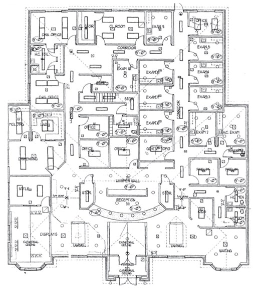
Here are the blueprints of the final layout of our new office space, Midwest City Vision Source.
Hardware
We chose oil-rubbed bronze for our hardware (doorknobs, hinges, cabinet and door handles, etc.). We wanted our faucets to match this color, but we quickly discovered that this faucet type is very expensive. So, we limited the oil-rubbed bronze faucets to the restrooms and exam rooms. The contact-lens room, labs and break room contain middle-of-the-road quality faucets, in terms of their look and design. The material of these faucets, however, ensure long use.
Matching the carpet
The last "matching" decision we had to make for the new facility was carpeting. We decided on a light-brown carpet with minimal texture for two reasons. First we felt the color matched almost any other color. Therefore, if we wanted to change the interior look of the office in the future, we could save money by retaining the carpeting. Second, We didn't want the texture of the carpet to be too rough. This is because we didn't want our elderly patients to be in danger of tripping and falling. consider that a lot of these patients drag their feet, and many use walkers.
Carpet layers installed carpeting only after the various workers completed all the many in-side projects that created dust and debris.
Finishing the inside job
During the decision-making regarding all the major parts of the building project, workers were also completing smaller side projects, such as connecting the faucets and installing covers on light switches and plugs.
Parking lot
Although the inside of the building was almost finished, completion of the parking lot was slow at best. This is because once the concrete dried, it became obvious that water damage would be an issue.
The problem: The engineer designed the parking lot to drain directly to the curb in front of our front door. This would not only impede patients, but lead to interior water damage.
Due to this not-so-insignificant oversight, we had to hire a new engineer to completely redesign the rest of the parking lot. Thankfully, his design ensured water flow would be minimal to our front door.
This redesign turned what should have been a one-to two-week project into a five-week project and significantly raised the parking lot cost.
Furnishings and art work
Workers completed the interior roughly one-to two weeks prior to the completion of the outdoor work. As a result, we started moving in what we could before our planned opening. This included lots of desks and filing cabinets.
We purchased most of our waiting-room furniture and other non-exam chairs and tables from a local furniture store. The furniture store's employees examined our interior colors and the office layout, so they could recommend items from their stock that they thought would best match the look of the office. Then, we visited the store to see these items, so we could decide whether we agreed with their choices. We picked furniture, such as non-medical chairs and tables, with their help. Then, they moved these items into our office, where they appropriately arranged them.
| The employees of a local furniture store examined our interior colors and layout, so they could recommend matching items from their stock. |
Since we bought a sizable amount of furniture from this store, the store's employee's provided us with a fairly good discount that made their prices better or equal to some of the larger furniture outlets in the area.
This store's employees also selected some hand-painted artwork from their store to display in a few key areas around the office. In addition, our office manager placed some very interesting wall-hangings, such as differently sized stars, throughout the new facility.
The furniture and artwork made the interior look very comfortable and homey — something we knew patients would like.
Making the move
With most of the outdoor work finished, we were finally ready to completely move into our new facility. Therefore, we closed our office at noon on a Friday and hired a moving company to move most of the heavy items, such as the diagnostic equipment. Then, we worked all weekend unpacking, setting up computers and preparing the new facility for its grand opening the following Monday.
Hindsight is always 20/20
In looking back on the design and building of our new facility, we'd definitely do a few things differently, and we'd definitely stick with the way we did other things.
Based on our own experience, here are six suggestions we feel you should follow when designing and building a new facility.
1. If you choose sheetrock for your walls and ceiling, consider a drop ceiling that contains noise-dampening properties. Sheetrock looks very professional and clean with texturing and paint, but it does cause some echoing in the building. As a result, we should have chosen a drop-tile ceiling that contains noise dampening properties to cut down on some of the echo. Drop-down ceilings also provide a nice amount of space, with which to store wires, should you need to add more equipment to your office in the future.
2. If you're planning to switch your office management software, do it before you move. We designed a new facility because our previous office was busting at the seems. The same thing occurred with our office-management software, in that it could no longer accommodate our expanding patient load. As a result, we needed new software that could.
We considered switching to this new software at the same time as the move, but we feared that two major simultaneous transitions would overwhelm staff, creating stress. Therefore, we started with the new software a few months prior to the move. We are very pleased with this decision, as it enabled us to become comfortable with the software before tackling the transition into the new office.
3. Make a list of how you want your builder to construct your building. Never assume your builder will ask you how you want him to construct the interior of your building. For example, if you want a certain type of window, you must tell him before he installs windows of his choosing. Another example: If you want bull-nose corners, you must tell him before the sheet-rock crew begins their job.
The best way to ensure the builder constructs the building according to your vision is to make a list of what you want, and provide him a copy. Then, review the list in detail with him, so he can't say, "You never told me you wanted me to do it that way."
Our builder never wrote anything down.
4. Never assume everything is correct just because it's written on the plans. If you see something that doesn't look right, ask about it. You'll likely be in the building the rest of your career. Therefore, you'll be much happier if your workers construct it according to your specifications, than if you silence your suspicions.
5. Hire a local, reputable architect and engineer. We discovered that a local engineer and architect are more than willing to help solve any problems that arise, as their reputation within your community is somewhat at stake. Talk to others who have worked with the architect and engineer in the past to ensure they're helpful and easy with whom to work.
We found it's best to select a builder prior to an architect, as the builder can use his vast experience in recommending an architect he feels is best for the job. This increases the likelihood of a great outcome, in terms of design and structure, for your facility.
6. Request an "instant hot" system for your faucets. This system constantly circulates hot water throughout the building so that when anyone turns on a faucet, the water is almost instantly warm. This is a very nice feature that we would recommend for any large building, as it can take a minute or two for the water temperature to turn from cold to hot. In an optometric practice, every minute counts.
Overall, building a new facility, is a long and sometimes stressful undertaking. It's well worth it, however, as it's an investment that should pay dividends in the future. OM
| Dr. Christensen specializes in contact lenses and primary care. He is senior vice president of Vision Source, L.P. and past president of Heart of America Contact Lens Society. Dr. Christensen is a 2004 graduate of Northeastern State College of Optometry. Dr. Smay is a 1996 graduate of Northeastern State University College of Optometry. He completed an Ocular Pathology Residency at the Western Oklahoma Eye Center. |


