signage
What Do Your Signs Say About You… and Your Office?
You can create messages that are both positive for your patients and effective for your practice.
MARK HINTON, ASHEVILLE, N.C.
Often, practices make snap decisions to place signage in response to a negative experience with a patient. The resulting message, fueled by our emotions, can make the patient feel like the bad guy. Rather than building a bridge to the patient, these signs create walls and barriers. Wouldn’t it be a more constructive approach to think carefully about what you truly want to convey, and then make it sound positive and inviting?
In this article, I offer guidelines to help you create signage that contains messages that are both positive for your patients and effective for your practice.
Forget the excuses.
The excuses, “Oh, I was in a hurry,” or “It [the sign] is just temporary, and we had to get a sign up” are not valid reasons to post “junky” (technical term) signage in the workplace. Take the time to create the right message.
In addition, remember that sharp, concise signage differentiates your practice from others. This is a good thing.
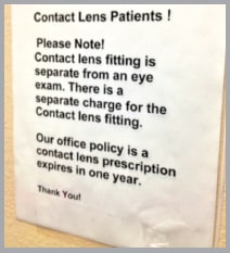
Sign 1 delivers a message that is best explained in person or reworded.
Start with the patient.
One of the more common signs, “No cell phones permitted,” is far from patient friendly. To determine whether a sign is patient friendly, try using this rule of thumb: Start with the patient in mind, and work backward. That is, if the patient would not consider the signage warm or welcoming, then you should change it.
This rule helps you avoid negatively focused signage that reads as if you are chastising the patient.
For instance, stay far from the word “policy” in any signage. Also, “Please note” is not patient friendly.
Use “social proof.”
When revising or creating signage, consider using “social proof” as a method to influence patients. Social proof is simply social consensus, or conforming to what others have gained or done in social circumstances. Using the cell phone example, why not try, “We appreciate you silencing your cell phone while in the office, and other patients appreciate this too. Thank you, Your Envision Eyecare Team.”

Sign 2 shows that an office message can be fun and suggestive.
Re-word bad signage.
In looking at Sign 1, we see messaging that could easily be expressed by reception when the patient arrives. However, for the sake of learning, imagine rewording this sign to inform:
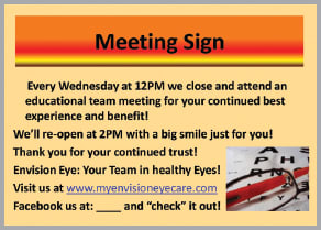
Sign 3 displays the benefits of meetings, rather than a sign that apologizes for them.
“Your best healthy eyesight is our goal. If you are a contact lens patient, we will do two examinations: One for your general eye health and sight, and one for your contact lens corneal health to ensure your contact lens fits and feels comfortable. For your advantage, as we do for all patients, we will perform these exams each year so we don’t miss anything that may be important for your best eye health.”
Patients, who, by the way, are also consumers, form impressions about such signs as Sign 1. And if asked to evaluate, they would grade them with a low score. It is also important to remember that patients/consumers appreciate signage that can be fun and suggestive, as demonstrated by Sign 2.
Don’t apologize. Explain.
Don’t post apologies on signs. For example, when office meetings are in session, forego the message: “We are attending a staff meeting… Sorry for any inconvenience.”
It’s best to explain why you are holding a “team” meeting (see Sign 3). You’ll impress patients when you explain with a positive spin.
Maintain a professional appearance.
Your signage should always have a professional look. Have you ever visited a business and noticed 8“x10” sheets of white printer paper with a note scrawled and taped to a wall? Not impressive, right?
Yet sometimes, we get so “busy” we forget to observe and nurture our office environment. As a result, we sometimes wind up with pieces of paper taped to walls — a sloppy presentation, rather than signage that is designed and printed professionally.
Review your messages.
For a fresh perspective on your signage, meet with your entire team at your office. Have everyone walk through the front door together, with fresh eyes, and pen and paper in hand. Without discussing aloud, have everyone take notes on how they feel about what they see. What would you change? Would you feel good about the experience you’re about to have?
| A “Stop” Sign: Words to Avoid |
|---|
|
But… |
Positive signage is simply about putting a positive spin on your message to patients. Scrutinize your signage before it goes up. It’s a reflection of you in the patient’s eyes.
Create your brand.
Also use signage to create your practice’s brand. The dispensing mat (Sign 4) is direct signage, and we created our own “brand” mat with a lot of social proof to connect to what others have said or how they benefited from the products shown on the sign. The mat focuses on the principal products we recommend for patients. This is all about our brand. We do not advertise the manufacturer brand on dispensing mats. It feels too “salesy.”
When patients leave, we offer a little “signage” for them to take in the form of a discount “gift” certificate for sunwear, so they’ll remember us and the message that we want them to prioritize their outdoor eye health. We don’t hand write it on a business card. This represents us, and it has to look professional.
Choose words carefully.
Positive messaging about how we feel about who we are, and why we do what we do is more important in signage and messaging than what we do.
Because the words are so incredibly important, whether they’re on a placard, an exam room wall or the intake forms (which in my mind also represents our signage, so to speak), choose carefully, and avoid words that are negative or may imply added cost or may limit or restrict your patient/consumer. (See the sidebar, “A ‘Stop’ Sign: Words to Avoid” on page 47.)
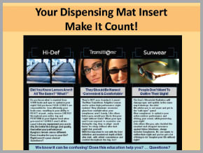
Sign 4, the dispensing mat, focuses on principle products and is all about the brand that the practice has created.
The words you choose have power to evoke emotion, positive and negative. Choose them carefully. As you do, remember that people are risk averse. The number-one emotional driver is self-preservation. The messaging in Sign 5 is designed to make people ask themselves, in reflection, whether this is important. It’s less negative and more about prevention.

Sign 5 uses powerful words to deliver a message about protection and prevention.
Final thoughts
Have you ever heard the adage: “No one cares how much you know until they know how much you care?” Here are ways to show you care:
▸ Reflect your care in all your messaging.
▸ Do not use loose paper signs taped to walls.
▸ Discuss the reason for the sign and what you want to convey. If it’s not positive, make it positive, or don’t post it.
▸ You can post “For the benefit of others … ”
▸ Be sure it is designed professionally with great graphics.
▸ Sometimes, less is more.
▸ Be informative: “Did you know …”
▸ Use manufacturer posters that inform without being pushy and “salesy.”
▸ Be the brand.
▸ Use a thesaurus to get creative.
▸ Make your signage reflect the consumers’ advantages or benefits. Consumers don’t buy the products, they buy what the product will do for them.
Use positive consumer messaging in your signage, set yourself apart with positive informative, suggestive, directive, and engaging signage and you’ll be happy with the results. OM

Mr. Hinton, CEO and president of eYeFacilitate, was in private practice and is a practice management strategist and communication expert. He travels, lectures and works with private practices. E-mail him at mark@eyefacilitate.com, or send comments to optometricmanagement@gmail.com. |

